When a patient steps into a hospital or clinic, the first thing they feel often isn’t medical-it’s emotional. Before the first doctor consult, before a single word is exchanged, the space itself communicates safety, professionalism, and care.
One of the most overlooked, yet most powerful, aspects of this experience is color.
At SUR DESIGNS HEALTHCARE RHYTHM, we believe color isn’t mere decoration. It’s a strategic tool to transform patient perceptions, reduce stress, and strengthen trust in your brand. In this guide, we’ll explore how color psychology in hospitals can be harnessed to design healing spaces, reduce anxiety, and communicate your clinic’s values effectively.
1. Why Color Matters in Healthcare Environments
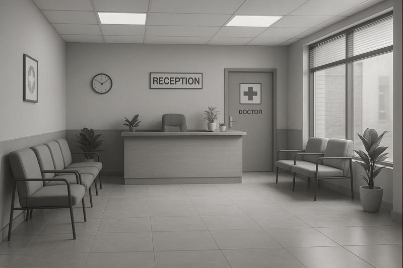
Walk into a typical government hospital in India: harsh white walls, outdated signage, sterile lighting. The result? It feels cold, intimidating, and often chaotic.
Now contrast that with a modern pediatric hospital: pastel walls, gentle illustrations, welcoming signage, comfortable furniture. Even before treatment, a sense of calm and trust is built.
Color is not simply about aesthetics. It shapes:
- Patient anxiety and stress levels
- Perceived professionalism
- Wayfinding and navigation
- Brand personality and trust
- Staff morale and focus
Healthcare design must recognise color as a silent healer. It works alongside interior layout, signage systems, even print materials like prescription pads and OPD files to create a complete patient experience.
2. The Science Behind Color Psychology
Color psychology studies how different colors evoke emotional responses. In hospitals, this is more than theory – it’s an applied science.
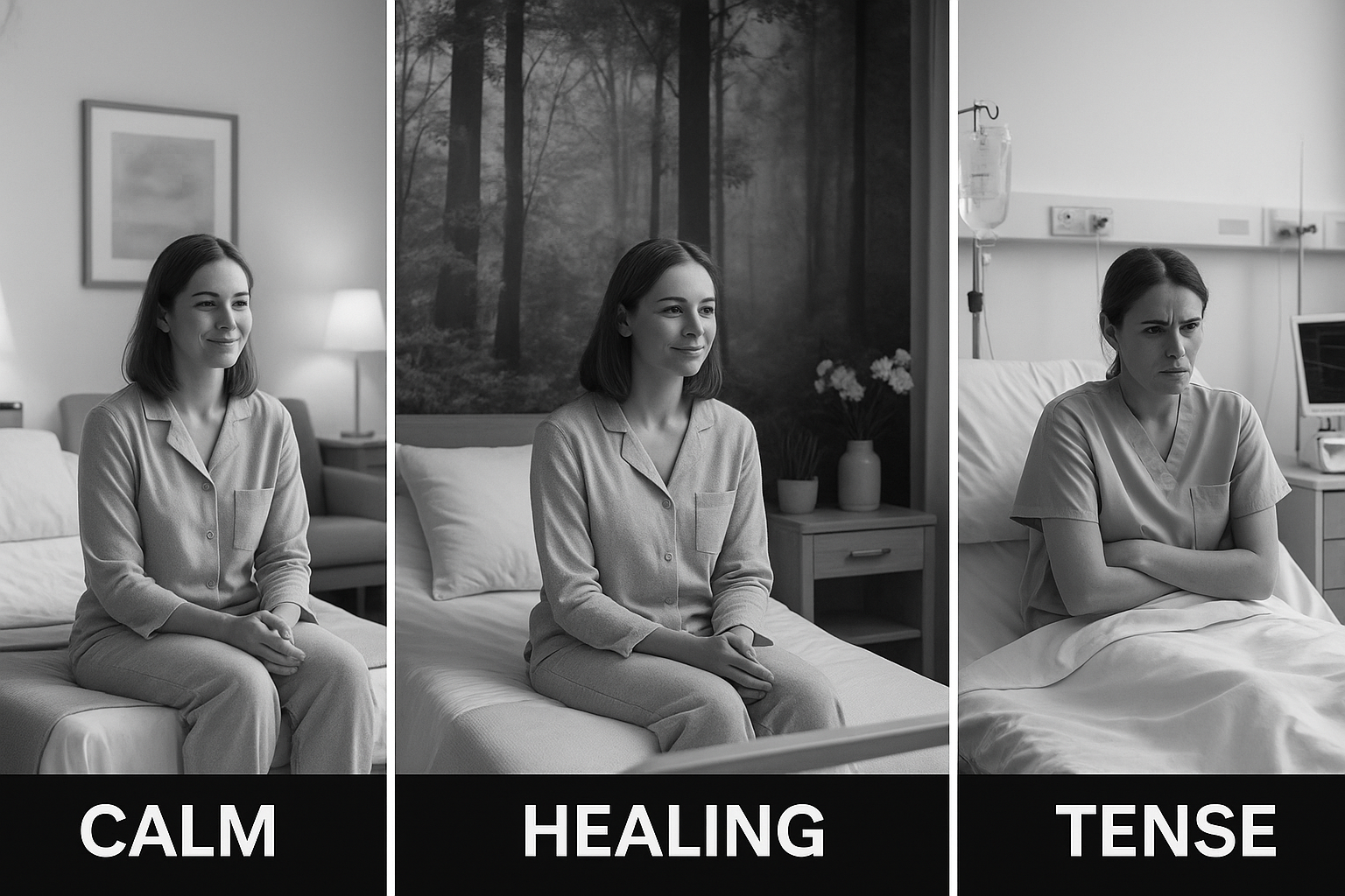
- Blues: Calm, trustworthy, professional. Light blues soothe anxiety and are often used in waiting areas and wards.
- Greens: Healing, restful, natural. Green evokes balance and recovery, making it popular in recovery rooms and counseling spaces.
- Whites: Clean, sterile, spacious. But too much stark white can feel intimidating. Soft off-whites work better.
- Yellows: Warmth, optimism. Best used sparingly, for accents.
- Greys: Neutral, grounding. Modern hospitals use warm greys to balance brighter colors.
Understanding these responses is essential for architects, designers, and hospital owners alike. The goal is to select palettes that match the function of each space.
3. Color Choices and Patient Emotions
Indian hospitals traditionally haven’t prioritised color psychology in design. But there’s a growing realisation that:
- Calm colors reduce stress in anxious patients
- Soft tones feel more premium and professional
- Consistent palettes help with brand recall
For instance:
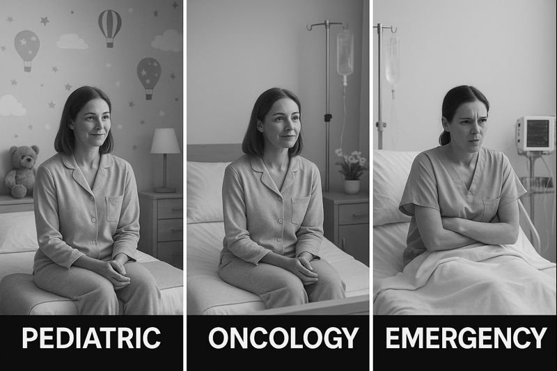
- A pediatric dentist’s clinic can use pale aquas and pastels to reduce fear among children.
- An oncology center can opt for gentle sage green to communicate care and empathy.
- An emergency ward might need clear, contrasting signage with controlled color use to avoid confusion.
At SUR DESIGNS, we often help clients select these palettes not just for walls but for the entire patient journey: from hospital signage to printed materials like leaflets and prescription pads.
4. Designing the Waiting Experience
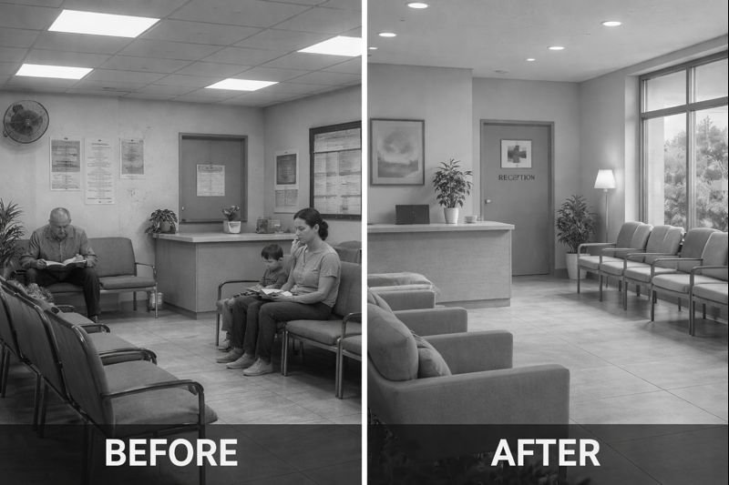
The waiting room is where anxiety often peaks. Patients and caregivers worry about diagnosis, costs, procedures.
This is where color can do real work:
- Soft blues reduce heart rate and lower perceived waiting time.
- Warm neutrals make the space feel clean but not clinical.
- Accent colors on cushions or artwork can break monotony.
Color also works with lighting design. Natural light combined with calming colors amplifies the soothing effect.
Interior design in Indian clinics must see color as a partner in care. Waiting rooms that reduce stress ultimately help staff too-less agitation, fewer conflicts, better communication.
5. Color and Wayfinding: Making Hospitals Easier to Navigate
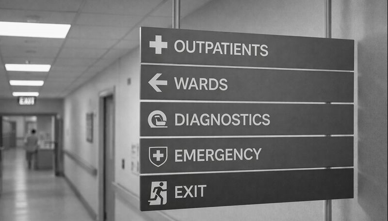
Indian hospitals often struggle with signage and navigation. Confused patients wander through corridors, asking staff repeatedly. This damages brand perception.
Color coding is one of the simplest, most effective solutions:
- Pediatric wing in pastel green
- Maternity ward in warm peach
- Diagnostic zone in light blue
- OPD files and prescription pads with matching color bands
Color-coded signage, floor strips, and door frames help patients feel in control. This is crucial for elderly patients or those with limited literacy.
At SUR DESIGNS, we develop hospital signage systems that use color intentionally-combining pictograms, local languages, and consistent palettes for easy navigation.
6. Cultural Sensitivity in Color Selection
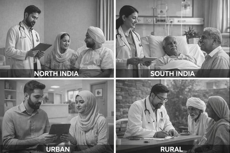
India is not a monolith. Color meanings vary by region, language, and culture.
- White is mourning in some traditions, purity in others.
- Red can suggest danger or auspiciousness.
- Green may evoke prosperity or specific community affiliations.
Good healthcare branding in India requires sensitivity. This is why we help clients localise their color choices, ensuring they resonate with their specific audience while still supporting the brand.
7. Building Brand Identity Through Color
Branding is more than a logo on a signboard. It’s the consistent experience you deliver at every touchpoint.
Color is a big part of this. When patients see the same calming blue in:
- Your logo
- Your website and social media
- Your reception desk
- Your prescription pads
- Your OPD files
- Your staff uniforms
…it builds a professional, trustworthy image.
It also improves brand recall. When people see your ambulance or clinic board in the same colors, they immediately know who you are.
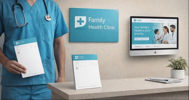
8. Color in Print Materials: Extending the Experience
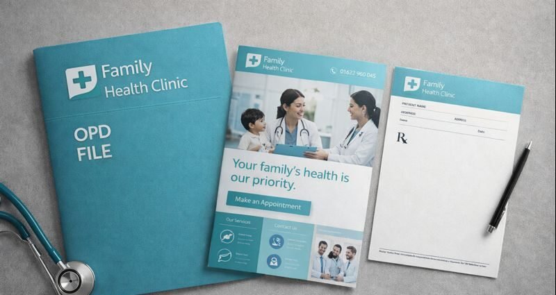
A beautifully designed clinic shouldn’t hand out cheap, poorly printed forms.
Patients take these materials home:
- OPD files
- Prescription pads
- Brochures and leaflets
- Discharge summaries
- Lab report folders
Color branding must be consistent here too. Using the same soothing palette on print builds trust and demonstrates attention to detail.
We help clients create print-ready designs that are easy to read, compliant with regulations like NABH, and aligned with their brand colors.
9. Staff Uniforms and ID Cards: A Subtle Brand Cue
Your staff are your brand’s daily ambassadors.
- Nurse scrubs in light blue or green communicate calm and cleanliness.
- Reception uniforms in gentle neutrals look premium and non-threatening.
- Doctor coats with subtle colored piping can carry your brand colors without being gaudy.
Even ID cards can match your color palette, making your brand consistent down to the smallest detail.
These choices reduce visual clutter, make staff easily identifiable, and show patients that your clinic pays attention to quality.
10. Color in Digital Presence
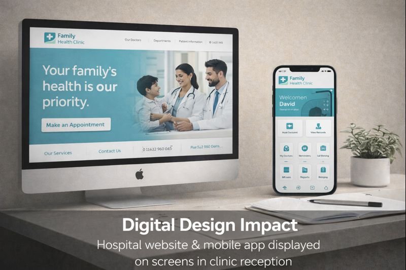
Most patients first meet you online. Your website, Google listing, or Instagram page is their first impression.
Color consistency online matters as much as offline:
- Soft, calming website backgrounds
- Branded buttons in your chosen color palette
- Instagram posts using consistent tones
- Highlighted services like dental treatments, pediatrics, or cosmetic procedures with themed colors
We often create digital branding kits for our clients that specify these color guidelines-making sure every designer, social media manager, or printer stays consistent.
11. Designing for NABH and Compliance
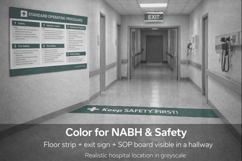
Accreditation isn’t just about documentation-it’s about delivering a consistent, high-quality experience.
Color plays a role in making compliance easier:
- Emergency exit maps with clear, color-coded paths
- Safety signage in contrasting colors
- SOP manuals with branded covers
- Consent forms with clear color-coded sections
Even in OPD files, color tabs can help segregate departments, making record-keeping more efficient and NABH-friendly.
We ensure that branding and compliance work together-not against each other.
12. Regional and Multilingual Adaptation
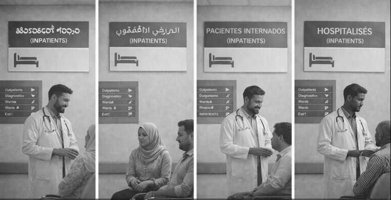
India’s healthcare space is multilingual by necessity. Color helps bridge language barriers.
- Icons with color cues for illiterate patients
- Signage in multiple languages with color-coded sections
- Bilingual leaflets with consistent design
We have designed for clinics that needed Kannada-English, Hindi-English, or Tamil-English systems-ensuring patients feel welcome and understood.
Color is part of that strategy.
13. Trends in Healthcare Color Use in India
Modern Indian hospitals are embracing global design principles while localising them for cultural context.
Emerging trends:
- Biophilic colors: muted greens and earthy tones
- Warm whites with natural wood accents
- Pastels for pediatric spaces
- Color blocking for wayfinding
- Sustainability with eco-friendly paints and materials
These trends show that Indian healthcare is no longer ignoring design-it’s seeing it as essential to patient experience and brand building.
14. From Small Clinics to Large Hospitals
You don’t need a 100-bed facility to benefit from color strategy.
- Single-chair dental clinics can choose a calm, modern palette that sets them apart.
- Physiotherapy centers can use greens and neutrals to suggest healing.
- Homeopathy and Ayurveda clinics can use earthy, organic tones to reinforce their philosophy.
- Diagnostic labs can use clean blues and greys to communicate precision and safety.
We tailor solutions to each client’s scale and budget, ensuring even small businesses benefit from professional branding.
15. Implementation: Turning Strategy into Reality

At SUR DESIGNS HEALTHCARE RHYTHM, we don’t just hand you a color code and walk away. We help you implement:
- Interior wall paint plans with color combinations
- Signage systems with color-coded maps
- Print-ready prescription pad and OPD file templates
- Uniform and badge designs in brand colors
- Website color guidelines for designers
- Social media post templates with consistent palettes
This comprehensive approach ensures every patient touchpoint supports the same story: we care about you.
Conclusion: Color is Care
In Indian healthcare, competition is rising. Patients have choices. They want not just the best doctors but the best experience.
Color is a simple, powerful, and cost-effective way to deliver that experience. It can calm, guide, reassure, and connect.
It’s not about fancy design for design’s sake. It’s about using every element—from your signage to your prescription pads—to say:
“We care about you. We want you to feel safe here.”
At SUR DESIGNS HEALTHCARE RHYTHM, that’s the philosophy we bring to every project.
📞 Ready to make your healthcare space truly healing?
Connect with us today for a consultation on transforming your brand through thoughtful, patient-friendly design.